Although possessing more preference than one another, each of the different data visualization techniques in Statistics can be used interchangeably when dealing with univariate and bivariate data. But when the data is multivariate, the only option you are left with is the Radar Chart.
Also known as the Spider Chart, this data visualization technique has so much semblance with a Spider web. It is able to generate this semblance from its equiangular spokes or radii, which represents each of the variables.
There are different types of Radar Chart, and its uses depend mainly on the nature of the data set and the aim of data analysis. Since this chart is also one of the readily available charts in Excel, this article will be covering different aspects of a Radar chart, including a simple guide on how to create one using Excel.
What is a Radar Chart?
A radar chart is a graphical method used for displaying multivariate data in the form of a two-dimensional chart of three or more quantitative variables represented on axes starting from the same point. (Source: Wikipedia).
This chart consists of a sequence of radii drawn from a center point. The number of radii to be drawn is determined by the number of variables present in the dataset, while its length is proportional to the magnitude of each variable with respect to the maximum magnitude of the variables in the dataset.
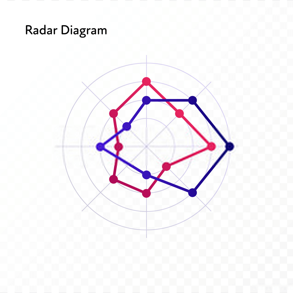
These radii are joined together by a line, giving it a star-like shape. In the end, the graph looks like a star stuck inside a web.
Types of Radar Chart
Radar charts are of three main types, namely; Simple radar chart, radar chart with markers, and filled radar chart. To properly illustrate these 3 types of radar charts, we will be using the sample data set below.
Radar Chart Example 1:

The above table contains the result of the annual appraisal carried out on 2 employees, Bryan and George.the employees were tested in different aspects, including Communication, punctuality, problem-solving, leadership, technical knowledge, and years of professional experience. Each of these aspects was graded on a scale of 1-5.
Simple Radar Chart
This is the most basic type of a radar chart amongst the three. It displays values with respect to the origin of the spider graph.
Simple Radar Chart displays the value of each variable in the dataset by joining the data points on the graph together.

Radar Chart With Markers
This is similar to the simple radar chart. The only difference is the fact that the Radar Chart has markers this time.
This type of data chart is constructed by first visibly marking the data points on the spider web, then joining these data points together.

Filled Radar Chart
The Filled Radar Chart is an extension of the simple radar chart. This chart type adds filling or colors to the empty space between the lines and the center of the spider web.
Filled Radar Chart is the most colorful chart amongst the three, and it is also very visually appealing. Also, unlike the radar chart with markers, the markers or data points are not visible on the chart.

When to Use Radar Chart
One of the most important things when choosing a data visualization technique for your dataset is knowing when to use a particular technique. Radar charts, just like other methods are best used in specific kinds of situations.
This section highlights the different situations when you should use a radar chart.
- When comparing Multivariate groups
The distinct feature of a radar chart is its ability to simultaneously compare different metrics to inform a decision. You can easily use the cover area of each group of data in the spider web to make an inference.
Therefore, when comparing two or more groups of multivariate data, the radar chart is the best data visualization method.
- Overall comparison of different items
Each of the groups displayed on the spider chart will cover a specific area based on its data. Especially, when using the filled radar chart, you can determine the overall metric of each group at a glance.
In the sample data visualized above, we can easily infer that Bryan is a better employee when compared to George.
Radar Chart Examples
Example 2: Consider the table below, showing students’ average test scores for each subject offered. Plot a filled radar chart for the test scores and use the graph to determine the class with the highest score in each of the subjects.

Solution: The average scores obtained in each subject by the three classes were shown in the radar chart below. The vertical scale used is 1:20. That is, 1 unit on the graph denotes 20 marks.

From the graph above, the classes with the highest score in each subject are:
Maths - Class1
Physics - Class3
Chemistry - Class3
Biology - Class1
English - Class2
Economics - Class1
Example 3: A consumer-market analysis was performed by an organization and the result of the analysis showed that product price, consumer income, and necessity were the top 3 factors that influence consumer’s choice of product. Where low price, high income, and high necessity translate to more demand.
These 3 factors were put on a scale of 1-5, with 1 indicating very low and 5 indicating very high. Consider Lucy, a consumer who wants to buy a phone and a laptop, but doesn’t have enough money to get the two at a time.
Use the information shown in the radar chart below to determine which of the two products Lucy is more likely to purchase. Hence, explain why.

Solution: From the diagram below, we conclude that Lucy is more likely to purchase the phone. This is because of the following:
- The phone is cheaper than the laptop. Given Lucy’s income, she is more likely to go for something cheaper.
- The phone has a higher necessity than the laptop.
Radar Chart in Excel
In this section, we will be illustrating the different steps you need to follow when creating different types of Radar Chart in Excel. Example 1 (employee competency test) above will be used as our sample dataset for this step by step guide.
Here are the steps to creating your own Radar Chart in Excel
- Step 1: Enter your data into your Excel workbook. Once, your data is well entered, select the data by highlighting it. Highlight the data from the first cell to the end as shown in the figure below.

Highlighting is important because it signifies the exact data you want to plot in Excel. It is very useful, especially in cases where you have various datasets in your Excel workbook.
- Step 2: Go to Insert>Charts>Other Charts|Radar. There are 3 different charts in this part for you to select from.
Simple Radar Chart
For a simple radar chart in excel, click on Radar as shown in the diagram below

Your simple radar chart will be generated with the data you highlighted in your workbook. You can add a title (Layout>Chart Title) or edit the axis (Layout>Axes>Primary Vertical Axes) in the Layout menu. See the diagram below for the resulting chart after little edits.

Radar Chart With Markers with Excel
For a marked radar chart, click on Radar with Markers as shown in the diagram below

Your marked radar chart will be generated with the data you highlighted in your workbook. You can edit the type of marker on your chart by right-clicking on the outlier, then on Format Data Series. Click on Marker Options>Built-in, then select your choice of marker as shown in the diagram below.

Filled Radar Chart in Excel
For a filled radar chart, click on Filled Radar as shown in the diagram below

You can change the fill color in the Design section. Edit the transparency of the fill area so that each of the plot areas becomes visible.
Right-click on the plot area, go to Format Data Series>Marker Fill and edit transparency as shown below.

Here you have your graph.

Uses of Radar Chart
- Employee Skill Analysis
Radar charts are very useful in the employee review and appraisal process. Companies can also use it to analyze general employee skills so as to influence the kind of training that should be organized.
As illustrated in the employee appraisal example above, HR Managers can simultaneously compare different factors in the employee competency dataset. This is very useful when considering 2 or more employees for a promotion.
- Consumer Choice Research
When conducting a survey to determine how consumers make product choices, you will need a spider chart to properly compare the factors that influence product purchases the most. Your survey may ask consumers to rate each of the factors that influence their decision making on a scale of say, 1-5.
The score for each factor is what will be plotted on the spider chart.
- Competitive Analysis
You can compare two or more products over a range of characteristics using a spider chart. When comparing the features of 2 laptop computers, for instance, you may want to consider things like battery life, Memory, HD display, etc.
With radar charts, you can compare these features to determine your competitor’s edge over you. This will assist you in making better products in the future.
- Matchmaking
Dating websites can use spider charts to help people make better dating decisions. For example, when considering 2 potential partners for a date, a spider chart will assist in analyzing the different features of the two candidates.
Having a feature like that to assist in making better dating decisions is great for dating sites.
Collect Reliable Radar Chart Data With Formplus
With the technicality of dealing with multiple variables, making sure the radar chart dataset generated for the variables do not mix up, can be quite challenging. Hence, finding a tool that enables you to collect, manage, and visualize your radar chart data in real-time is integral to drawing better conclusions.
Formplus is a smart form builder that eliminates the complexity of data collection by helping you collect, track, and automate the data collection process. Below are some of the things Formplus will do for you.
- Collect Large Data
There is no limit to the amount of data you can collect with Formplus. There are over 30 form fields in Formplus to collect multiple data for each of the variables under consideration.
You can also receive file attachments like images, documents, audio, etc with no limitation on size. All this information is kept in secure cloud storage that cannot be accessed by a third party.
This is very useful for organizations that carry out large surveys, especially during a market analysis, product research, or consumer behavioral research.
- Manage Data
Formplus helps you store, manage, and analyze your data before visualizing it on the radar chart. Besides the secure cloud storage provided by Formplus, you can also store your data on one of Google Drive, Microsoft Onedrive, and Dropbox.
The amazing part of all this is that you don’t have to go through the stress of importing and exporting your data. Your cloud storage will be automatically updated in real-time.
- Team Management
Collaborate with team members, create workflows, and approve data with the Teams/Collaboration feature on Formplus. With this feature, you can add important team members to your account, and assign roles to them.
This will enable you to simultaneously collect and format the data required for your radar chart. You can also assign roles to team members so that they only have access to specific aspects of your data.
When collecting data for employee appraisal, for instance, you can assign a team member to create the appraisal form, and also prevent him or her from accessing the data collected through this form.
- Employee Appraisal
Ensure your employees are well rewarded for their hard work with a regular appraisal. Formplus makes this process an easy one by with the Employee Evaluation form template.
You can send this employee evaluation form to Managers so that they can evaluate their team members. Once a team member is evaluated, you receive an automatic notification via email.
That way, you can visualize the data immediately it is collected. This is particularly useful when considering two or more employees for the same role.
In such a case, each of these employees’ data will be plotted on the radar graph.
- Collect Personalized Data
Share forms privately with your team members and collect radar chart data on the go. With Formplus forms, you can choose to share forms privately with people on your team, or organization.
This is a very great way for HR to receive personal feedback from employees, most especially when carrying out an Employee Exit Survey. Visualize employee exit survey data on a radar graph to discover why your employees are quitting, in order to make improvements.
To send a private form to an employee, they need to be added as a user to your Formplus account. The only way, a private survey can be accessed is by requesting access from the Team administrator.
This will help ensure that a third-party doesn’t have access to the survey.
Advantages of Radar Charts
- It tells a vivid and visual story about the dataset, which can be easily understood by a layman.
- They can compare multiple sets of data or changes that occur over time. This is one of the distinct advantages of radar charts. It allows you to analyze several variables with less cluttering compared to other charts.
- Comparisons are easy and fast with radar charts.
- The outliers are easily noticeable on radar charts because they do not overlap with other variables on the graph.
- They can compare unrelated variables. In the employee appraisal example above, for instance, we used different metrics that do not relate to each other in grading the employees.
Disadvantages of Radar Charts
- Has limited uses in data analysis. Radial charts only work for a specific kind of data, rendering it useless in many cases.
- They are not a good choice for trade-off decision making.
- It is hard to visually compare lengths of different spokes because radial distances are hard to judge.
- Their effectiveness is limited to small and medium-sized multivariate datasets. Plotting radar charts becomes overwhelming and the chart becomes unreadable when dealing with large data.
- They can sometimes distort data, especially when having a full area.
Conclusion
Radar charts are frequently used for a detailed evaluation and comparison of two or more multivariate datasets. Some of its major strengths are visual appeal and ease of use.
Through comparative data analysis, individuals can make inferences regarding the superiority of one group of data over the other. It analyzes performances and also makes a visual representation of the strengths and weaknesses of each group.
This representation is usually vivid and tells a beautiful story with the dataset. Although very good for data visualization, it can easily be substituted with a line chart, especially when performing time series analysis.