When you hear the word pie, the first thing that will probably come to your mind is a pizza slice, snack, or pie - literally everything else asides from a pie chart. This is most likely going to be where your train of thoughts will go if you are not a data analyst, statistician, or mathematician.
The pie chart is a graph named after a sliced pie, due to their semblance to each other. Originally created by William Playfair, this data visualization method is widely used in business and mass media.
Unfortunately, the rest of this article may not necessarily have anything to do with pies or pizza slices. However, the amazing part is that you can enjoy multiple pizza slices while you learn about pie charts and how to create one using Excel.
What is a Pie Chart?
A pie chart is a circular graph divided into various sectors to illustrate numerical proportions. In other words, the pie is divided into different slices, with each slice representing the frequency of the processes in the dataset.
The entire pie represents 100% of the dataset, while each sector/pie slices represents a portion of the whole dataset. The portions that exist in the pie are measured as an angle of the total 360 degrees.
Pie charts give a visual representation of how a data set is broken down into smaller pieces with the aid of a pie. It can be difficult drawing a pie chart by hand, which is why it is better to construct with the aid of computer programs like Excel.
Types of a Pie Chart
Pie charts are classified into two main types based on the dimension of the graph. These 2 types are namely; 2D pie chart and 3D pie chart.
2D Pie Chart
A 2D pie chart is a circular graph that visualizes the percentage of occurrence of particular variables in a dataset. This type of pie chart displays the entries of the pie chart in 2 dimensions.
The 2D pie chart is further classified into 4 types based on how the variables are visualized on the pie chart. To properly visualize these classifications of a 2D graph, let’s consider the following example.
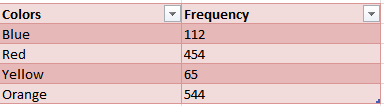
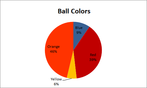
Example 1: Consider the table below which shows the data of the number of balls in a box according to their colors.
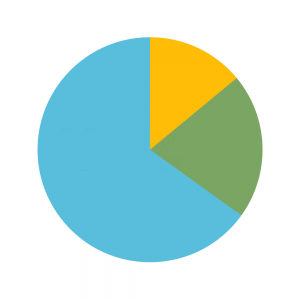
Simple Pie Chart
A simple pie chart or simply called a pie chart is the most basic type of pie chart. It is the general visual representation of a pie chart.
It displays the contribution of each value to a total.
Exploded Pie Chart
An exploded pie chart is generated by separating the pie from the chart as opposed to joining them together. This is usually done to lay emphasis on a particular slice or sector in a pie chart.
This chart displays the contribution of each value to a total while individually emphasizing them.
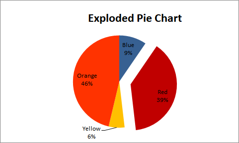
In the illustration above, the pie representing Red exploded from the rest of the pie. This will make Red easily noticeable and stand out from the rest.
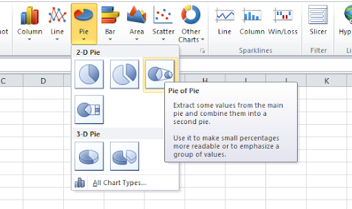
Pie of Pie
Pie of pie is a simple way of representing more categories on a pie chart without having a congested graph that is difficult to read. As the name implies, a pie of pie is a pie chart generated from an existing pie chart.
It extracts some values from the main pie and combines them to form another pie.
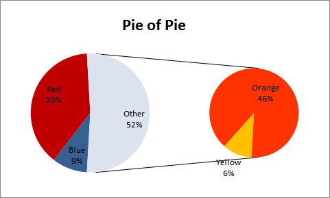
The illustration above generated a pie chart with two variables, orange and yellow from an existing simple pie chart.
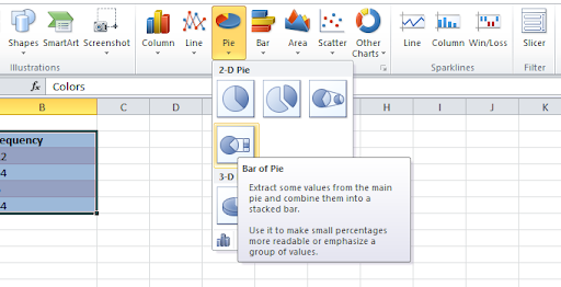
Bar of Pie
A bar of pie is another simple way of representing more categories on a pie chart while avoiding congestion on the pie chart. Although they serve similar purposes, unlike the pie of pie, the extension generated from the existing pie chart is a bar graph.
It extracts some values from the main pie chart and combines them into a stacked bar.
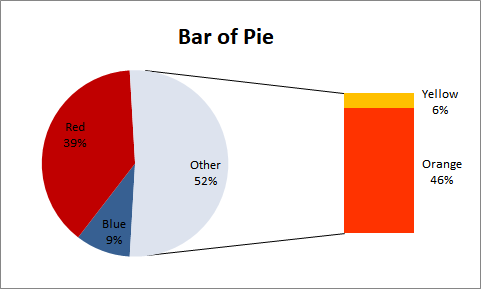
In this case, the extension of the pie chart is a stacked bar graph.
3D Pie Chart
The 3D pie chart is a 3-dimensional representation of a pie chart. It is usually used for aesthetic reasons and does not improve data visualization on the pie chart.
On the contrary, it distorts the graph and makes it difficult to read. The 3D pie chart is subdivided into two different parts, namely; the simple 3D chart and the exploded 3D chart.
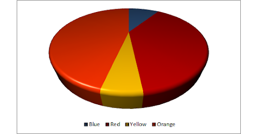
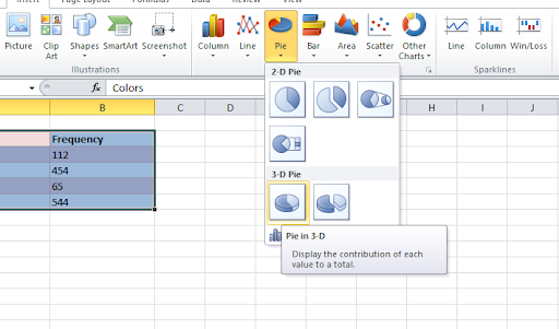
Simple 3D Pie Chart
The simple 3D pie chart is a 3-dimensional version of the simple pie chart. It visualizes the dataset on the x, y, and z axes.
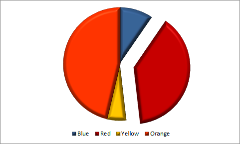
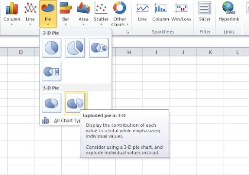
Exploded 3D Chart
The exploded 3 D chart is a 3-dimensional version of an exploded pie chart.
Pie Chart Calculations & Formula
Data can be visualized on a pie chart in degrees or percentages. When visualizing a dataset using percentage, the percentage of each value is calculated using the following formula:
Percentage of each value =(ValueTotal value)100
To determine how many degrees should be covered by each pie sector, we use the following formula:
Degree of each value =(ValueTotal value)360
After calculating the degrees covered by each pie, we can construct the pie chart by using a compass to draw the circle, and a contractor to measure the degrees covered by each component from the center point. To better explain the calculations involved in a pie chart, let us consider the example 1 above.
We will now calculate the percentage and degrees covered by each of the colors in the following simple steps.
Step 1: We add the frequency values together to get the total frequency. So, we have: Total values = 112+454+65+544 = 1175
Step 2: We calculate the percentage of each color in the box of balls using the formula above.
Blue: (1121175)100 = 9.53%
Red: (4541175)100 = 38.64%
Yellow: (651175)100 = 5.53%
Orange: (5441175)100 = 46.30%
Step 3: We calculate the degrees of each color in the box of balls using the formula above.
Blue: (1121175)360 = 34.3
Red: (4541175)360 = 139.1
Yellow: (651175)360 = 19.9
Orange: (5441175)360 = 166.7
Step 4: Draw a circle and draw the degrees using a protractor.
Conversely, if you are reading a pie chart and want to know the values of each pie represented on the chart, follow these simple steps.
To calculate the value of each pie on the chart, all you need is the total number of values in the chart, and the degrees or percentage occupied by the pies. Then, the value is calculated using this formula:
Value = (Degree360)Total value
Or
Value = (Percentage100)Total value
Using the example 1 above, we have:
Blue: (9.5% 100)1175 = 112
Red: (38.64%100)1175 = 454
Yellow: (5.53% 100)1175 = 65
Orange: (46.3%100)1175 = 544
Blue: (34.3360)1175 =112
Red: (139.1360)1175 =454
Yellow: (19.9360)1175 =65
Orange: (166.7360)1175 =544
Pie Chart Question Examples and Answers
Example 2: A community has been deserted for years and has become occupied by various kinds of animals. The government is trying to evacuate the animals and move them to the zoo.
A survey was therefore carried out to determine the number and demography of animals living in this community. The results of this survey are shown in the table below.
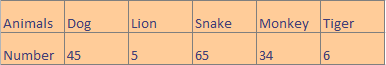
Use this result to create a pie chart. Hence, calculate the percentage occupied by each animal living in the community.
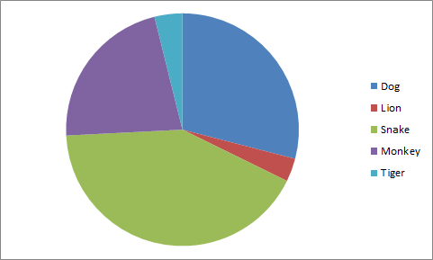
Solution: We generated the following pie chart from the table
Hence, the percentage occupied by each animal is calculated below:
The total number of animals occupying the community is 45+5+65+34+6 = 155.
Dog: % Dog = Number of DogsTotal Number 100
= 45155100 = 29% (Approx.)
Lion: % Lion = Number of LionTotal Number 100
= 5155100 = 3% (Approx.)
Snake: % Snake = Number of SnakeTotal Number 100
= 65155100 = 42% (Approx.)
Monkey: % Monkey = Number of MonkeyTotal Number 100
= 34155100 = 22% (Approx.)
Tiger: % Tiger = Number of TigerTotal Number 100
= 6155100 = 4% (Approx.)
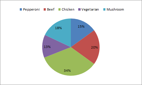
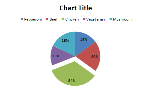
Example 3: The pie chart below shows the average amount of pizza ordered daily by customers of a small pizza outlet.
If the average total number of pizzas ordered daily is 100, determine the average number of pizzas ordered for each variety of pizza. Hence, use this information to calculate the degrees of the sector occupied by each pizza variety on the chart.
Solution: The average number of pizzas ordered daily for each variety of pizza is calculated below
Pepperoni: Pepperoni orders = Percentage pepperoni order100Total number of pizza
= 15100100 = 15pizzas
Beef: Beef orders = Percentage Beef order100Total number of pizza
= 20100100 = 20pizzas
Chicken: Chicken orders = Percentage Chicken order100Total number of pizza
= 34100100 = 34pizzas
Vegetarian: Vegetarian orders = Percentage Vegetarian order100Total number of pizza
= 13100100 = 13pizzas
Mushroom: Mushroom orders = Percentage Mushroom order100Total number of pizza
= 18100100 = 18pizzas
Hence the degrees of the sector represented by each pizza on the chart is calculated below:
Pepperoni: Pepperoni (degrees)= pepperoni order100360
= 15100360 = 54
Beef: Beef (degrees) = Beef order100360
= 20100360 = 72
Chicken: Chicken (degrees) = Chicken order100360
= 34100360 = 122.4
Vegetarian: Vegetarian (degrees) = Vegetarian order100360
= 13100360 = 46.8
Mushroom: Mushroom (degrees) = Mushroom order100360
= 18100360 = 64.8
Example 4: Construct two exploded pie charts from the information in Example 1 above. The first chart should emphasize the pizza with the highest daily orders, while the second chart should emphasize the pizza with the lowest daily orders.
Solution: Pepperoni has the lowest daily order, and is exploded in the graph below.
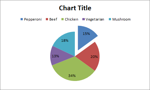
Chicken Pizza has the highest daily order and is exploded in the graph below
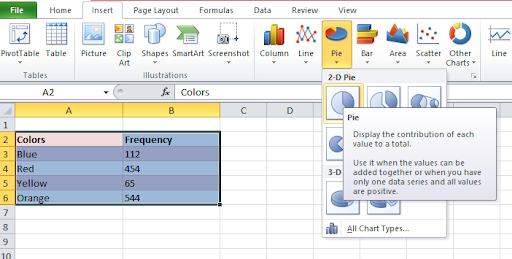
How to Construct a Pie Chart With Excel
In this section, we will be constructing a pie chart using Example 1 above.
- Step 1: To construct a pie chart, enter your categorical variable and the numeric variables in the worksheet.
- Step 2: Highlight the dataset you would like to visualize using a pie chart, then go to Insert>Charts>Pie>2-D Pie|Pie to construct a simple pie chart.
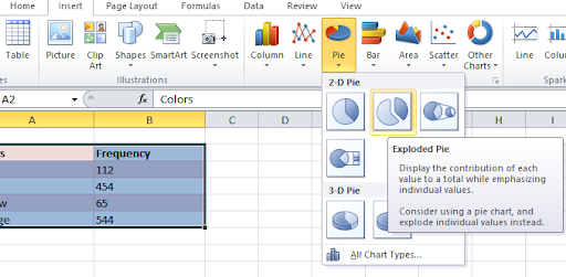
- For an Exploded Pie Chart, go to Insert>Charts>Pie>2-D Pie|Exploded Pie to construct an exploded pie chart as shown in the diagram below.
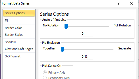
You can edit the gap in-between the exploded slices by right-clicking on the pie, then go to Format Data Series>Series Options| Pile Explosions. Then edit it as you please.
- For Pie of Pie, go to Insert>Charts>Pie>2-D Pie|Pie of Pie to construct a pie of pie chart as shown in the diagram below. You can edit the gap in-between the main pie and the generated pie by right-clicking on the pie, then go to Format Data Series>Series Options| Gap Width. Then edit it as you please.
For Bar of Pie, go to Insert>Charts>Pie>2-D Pie|Bar of Pie to construct a bar of pie chart as shown in the diagram below. You can edit the gap in-between the main pie and the generated stacked bar graph by right-clicking on the pie, then go to Format Data Series>Series Options| Gap Width. Then edit it as you please.
For a 3-D Pie Chart, go to Insert>Charts>Pie>3-D Pie|Pie in 3-D to construct a simple 3D pie chart as shown in the diagram below. You can edit the rotation and structure of the 3-D chart by going to Layout>Background|3-D Rotation. Go ahead and edit the rotation of the chart as you please
For an Exploded 3-D Pie Chart, go to Insert>Charts>Pie>3-D Pie|Exploded Pie in 3-D to construct a simple 3D pie chart as shown in the diagram below.
Pie Chart vs Donut Chart
Named after a donut due to its resemblance to one, a donut chart helps to collect more complex data than a pie chart. In other words, we may say that a donut chart is a superset of a pie chart.
Pie charts are used to measure the proportion of the elements in a dataset. It uses proportion to determine the angles of each pie on the chart, then draws accordingly.
However, a major setback recorded when working with a donut chart is that it becomes congested and unreadable when dealing with large datasets. Also, it cannot visualize multiple groups of data.
These setbacks are one of the main issues addressed by a donut chart, solving some of the disadvantages of a pie chart. The over congestion of the circular graph is addressed by allowing mini-donuts to be added to an existing donut chart.
That way, we will have multiple rings in a donut chart. This feature is also what solves the issue of visualizing multiple groups on data.
The donut chart can visualize multiple groups of data by adding the chart for each new set of data to the center of the existing donut chart.
Uses of Pie Charts
- Company Sales
Companies can clearly showcase their yearly sales on a pie chart. The pie chart gives a clear picture of how sales were made in a company at a glance.
For example, a boutique can visualize the number of sales made for each product (shoes, bags, t-shirts, etc.) using a pie chart.
- Education
Schools can use a pie chart to showcase how much time is allotted for each subject offered by students. Viewing this information at a glance using the pie chart will help identify courses that do not have enough time and how the time allocation procedure can be improved.
- Budget and Financial Planning
Pie charts can help individuals better plan their finances and track where and what they are spending money on. This will help in making better financial decisions and planning towards maximizing income and reducing costs.
Disadvantages of a Pie Chart
- It is not effective for visualizing large datasets. At a point, the chart will become congested and unreadable. The more slices, the harder it is to read.
- It can only be used to visualize a single dataset. That is, you will need to construct multiple pie charts when comparing different groups of data. For example, when comparing the performance of students in each subject, it will be infeasible to use a pie chart when visualizing this data for more than one class.
- It may lead to inaccurate conclusions from the data due to errors in visually estimating the angle of each slice in the pie.
Conclusion
Pie charts are no doubt a great data visualization method. However, it is not the best option in some cases, especially when dealing with a large dataset.
One of the most common alternatives used in place of a pie chart is the donut chart, which helps to make a better comparison in a dataset. This chart possesses the structure of a pie chart, with the only difference being the circle hole in the donut chart.
The hole in the donut chart allows for further data visualization.